What a Design System?
A Design System is a complete guide that brings together all your design rules and the components you will use to create your digital product in a consistent way, helping you move faster and scale your design efficiently.
What is it for?
- To ensure everything has the same style and consistency.
- To speed up the design process.
- To scale your design and build hundreds of screens without chaos.
- It helps reduce random variations of your components.
- And it results in a better experience: users recognize patterns and navigate more intuitively.
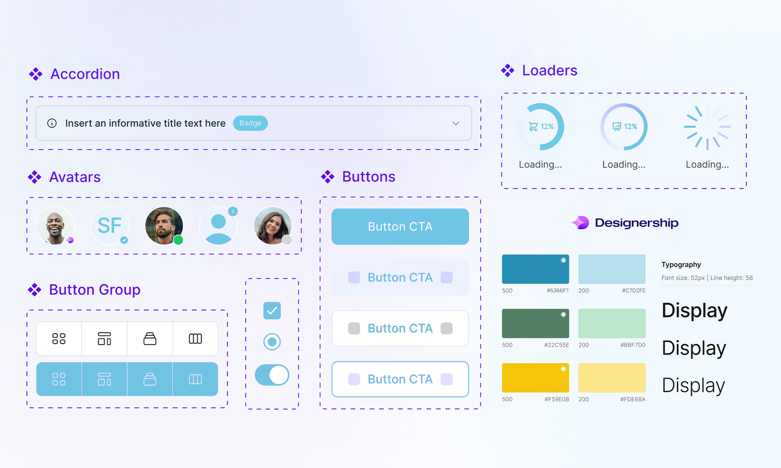
It includes:
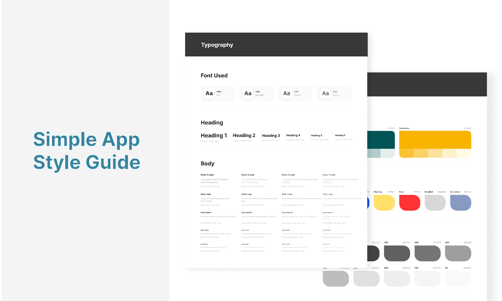
1. Visual Identity
- Colors (primary, secondary, states, etc.)
- Typography and text styles
- Iconography
- Spacing, grids, shadows, borders…
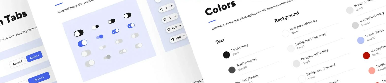
2. Reusable Components
These are the building blocks used to create screens:
- Inputs and forms
- Buttons
- Cards
- Modals
- Navigation menus
- Tables
- Badges…
Each component has:
States (hover, pressed, disabled…)
Variants (size, style…)
Behavior (how it works)
3. Design Tokens
Variables that control:
- Sizes
- Colors
- Spacing
- Radius
- Animation durations
They allow you to update the entire product at once (for example, changing a color for dark mode).
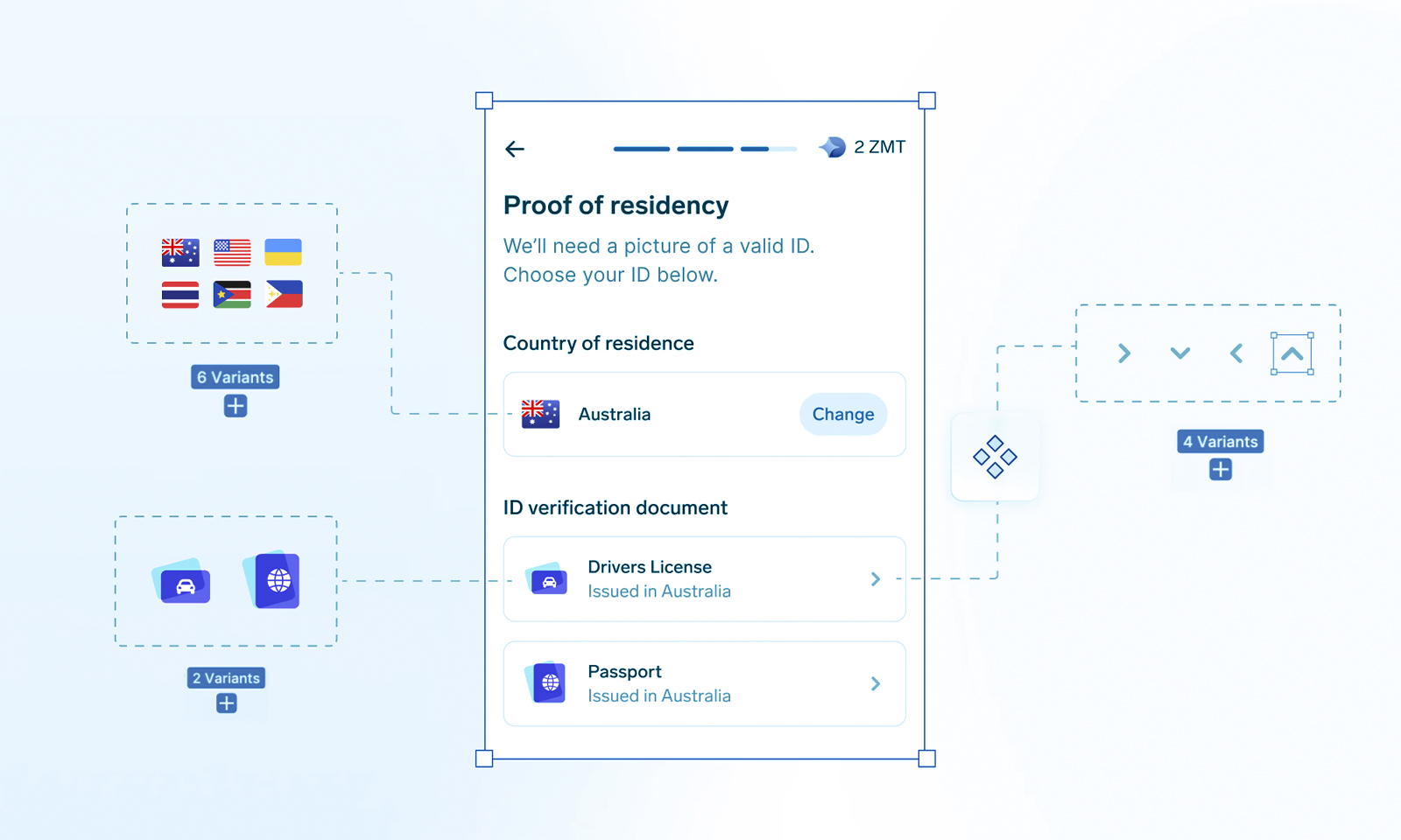
4. Guidelines
How to use each component
- Accessibility rules
- When to use each pattern
- Visual tone
- Examples of correct and incorrect usage
Examples of correct and incorrect usage