
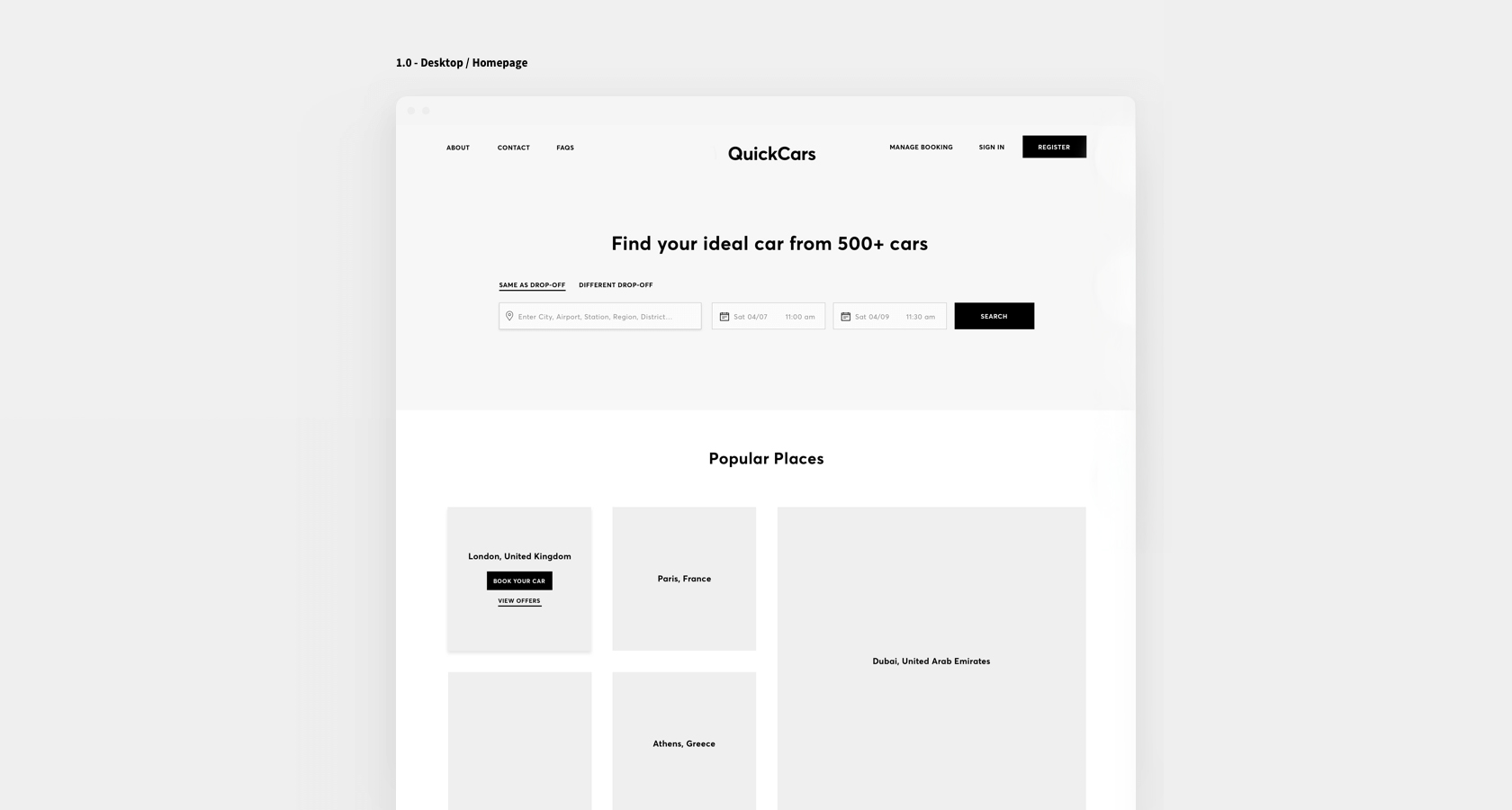
Intuitive interface with UI best practices
Designing an intuitive interface means the user should understand how to use it without having to think too much. To achieve this, UI (User Interface) guidelines provide key principles that help create clear, consistent, and easy-to-use interfaces.
Below are the most important fundamentals.
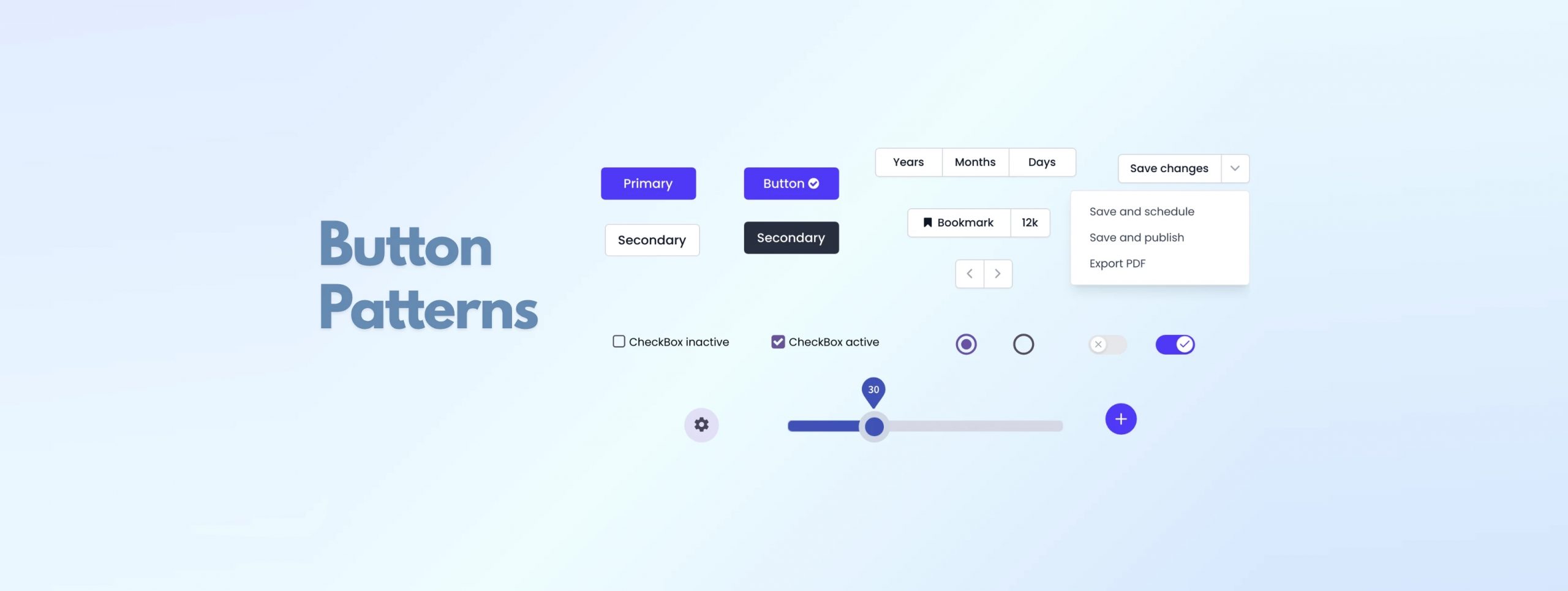
1. Visual and functional consistency
Consistency is the most important pillar.
- Same colors for the same actions
- Same sizes and styles for similar elements
- Same interaction patterns across the interface
If primary buttons are solid and blue, they should look the same throughout the app.
This reduces cognitive load and creates a smooth experience.

2. Clear visual hierarchy
The user must know what’s most important and what they need to do first.
- Different sizes for headings, subheadings, and body text
- Sufficient contrast for key elements
- White space to let content breathe
Highlighted buttons for primary actions (CTAs)
3. Recognizable UI patterns
- Bottom navigation on mobile
- Hamburger icon for menus
- Cart icon for shopping
- Green check = correct
- Red = error
Users already know how these work, which makes the interface immediate and intuitive.
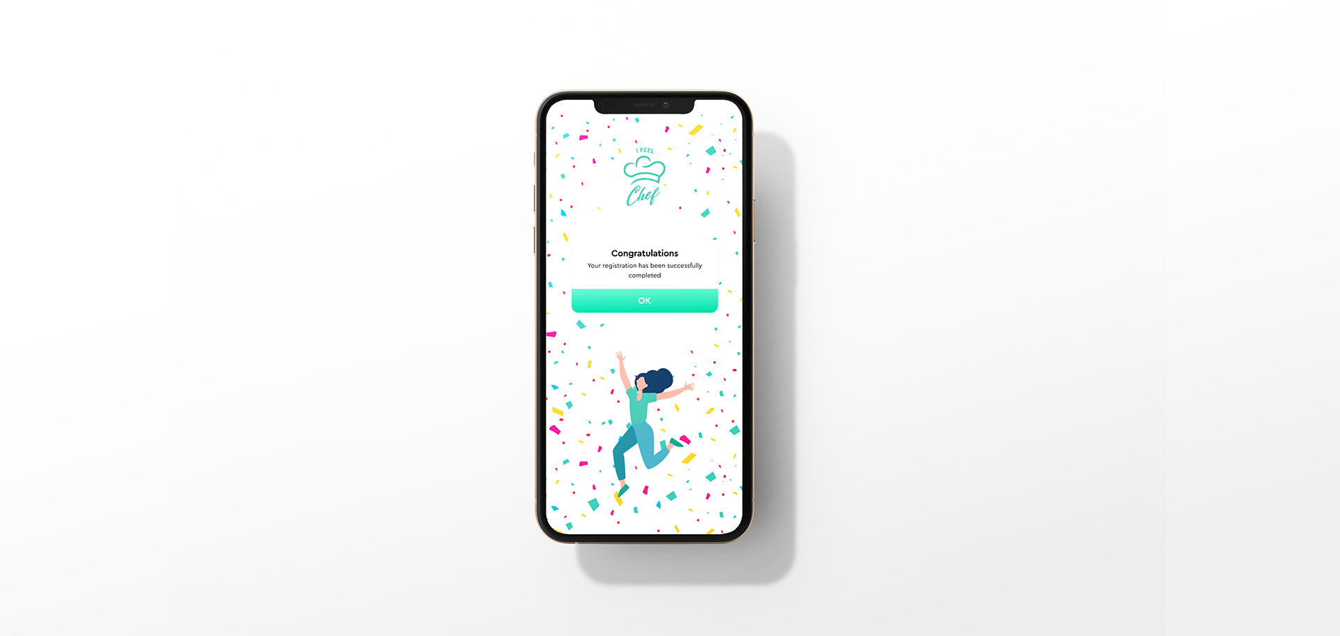
4. Immediate feedback
The system should visually respond to every user action:
- Button press animations
- Success/error messages
- Hover/active/disabled states
- Loading bars or skeletons
This builds trust: the user knows the app is working.
5. Clarity and simplicity
Less is more.
- Avoid cluttered screens
- Short messages
- Clear actions (ideally 1 main action per screen)
- Avoid unnecessary decisions
A simple interface is always faster to use and easier to understand.

6. UI Accessibility
The interface should be usable by anyone.
- AA or AAA contrast ratios
- Minimum font size (14–16px)
- Touch targets of at least 44px
- Avoid using color as the only signal (e.g., errors also need icons + text)
Improving accessibility also improves overall usability.

7. Effective Use of Color
Color communicates.
- Primary colors for key actions
- Neutral colors for secondary elements
- Status colors: green/success, red/error, yellow/warning
Color guides and organizes the interface without needing words.

8. Small Animations That Clarify What’s Happening
- Changing icons when saving
- Animation when adding to cart
- Smooth transitions between screens
These details make the interface feel more human and intuitive.

9. Goal-Driven Design
Before designing, define:
- What is the user trying to achieve?
- What is the primary action of this screen?
- Which steps are essential and which are not?
An intuitive interface is born from deeply understanding the user.