


An app that connects people who love to cook, combining usability and design in a single experience..
UX/UI Case Study
Today I Feel Chef is a mobile app that turns cooking into a social experience.
It’s not just about recipes, but about connecting with people through real dishes, personal stories, and individual inspiration.
The goal was to design an intuitive platform guided by the values of cooking where users can discover, create, and share their ideas.
Focus: Research, competitive analysis, user interviews.
Output: Insights & opportunities
Focus: Personas, journey map, information architecture.
Output: Problem statement
Focus: Wireframes, task flows, low-fi prototypes.
Output: Validated flows.
Focus: Visual language, UI kit, interactions, accessibility, responsive layouts, and design system scalability.
Output: High-fi design.
Focus: Usability testing, iteration, handoff.
Output: Final prototype
✅ Most apps focus on individuality rather than connection.
✅ Lack of bonding through shared hobbies and interests.
✅ Recipe creation focused only on visuals, not on the actual steps and personal tips.
Problem statement:
Users need an inspiring way to explore and share recipes naturally and effortlessly.
How might we…
How might we make cooking feel social and creative while keeping the interface simple and calm?
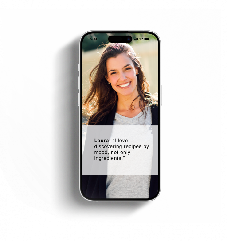
Motivation: Loves cooking for family
Pain points: Feels overwhelmed by cluttered apps
Needs: Wants simplicity & creativity
Motivation: Fitness and meal-prep fan
Pain points: Lacks inspiration
Needs: Wants to discover healthy ideas
The early wireframes focused on content hierarchy and visual balance.
The system balances freshness and calm, reflecting the emotional tone of the brand.
Every part of the app was designed to guide users in the easiest and most intuitive way possible.
The interface prioritizes clarity and the excitement of cooking and creating new recipes.
Microinteractions reinforce feedback, from liking a recipe to publishing one, creating a sense of flow and continuity.
A Figma prototype was tested with 3 users.
Main findings:
Simplified navigation improved task success.
Users valued the “create recipe” flow and the easy-to-follow visuals.
This project taught me to merge UX logic with the power of a more human, user-centered design, shaping an experience that is not only useful but also connects people.