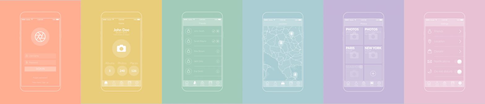
How to know if an interface is truly intuitive
Many times we assume an interface is intuitive because it feels clear to us and because we designed it that way.
We created it, we know the product, we understand its rules. But intuition is not measured from the inside, it’s measured from the outside.
An interface starts to be intuitive when someone who doesn’t know the product can understand what to do almost immediately.
Because the interface itself guides them. When, at first glance, they know where to click, what matters, and what to expect from each action, the design is doing its job well.
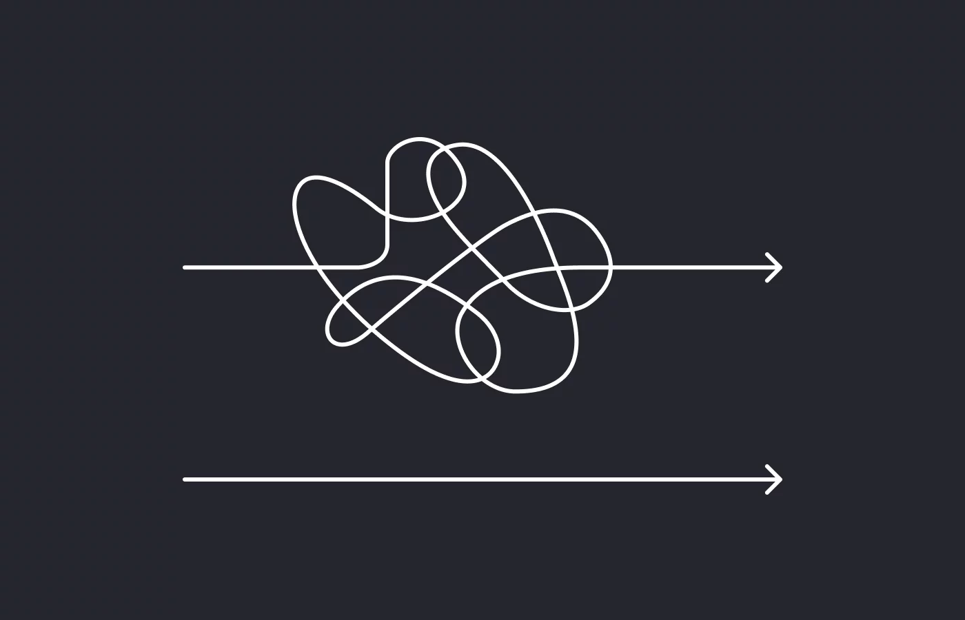
If a screen needs too many explanations, tutorials, or supporting texts to work, the problem is probably not the user. The visual hierarchy, the information order, or the prioritization of actions aren’t helping decisions feel natural. Text should support and reinforce, not rescue a confusing interface.
It’s also key that elements behave the way users expect.
Patterns exist for a reason: they reduce cognitive effort. When a button doesn’t look like a button or an important action is hidden, the user has to stop and think. And every pause is friction. Breaking patterns can work, but only when it’s done intentionally and adds clarity, not just aesthetics.
An intuitive interface also understands that making mistakes is human. Instead of punishing errors, it prevents them, explains them, and offers ways out. If users keep making mistakes, it’s not clumsiness, it’s a sign that the design isn’t anticipating their decisions well enough.
The best sign that an interface works is when users move forward without thinking too much. They don’t stop to figure out what things do, they don’t feel blocked, they don’t need to double-check every step. They simply flow.
A simple exercise is to try to describe each screen with a single clear sentence: “this screen is for…”. If you need a whole paragraph to explain it, there are probably too many actions competing with each other, or the main goal isn’t clear enough.