


This is how I build a Design System from scratch
Scroll down
I start by analyzing:
Visual inconsistencies
Repeated patterns
Design debt
Accessibility issues
Duplicated components
Misalignment with development
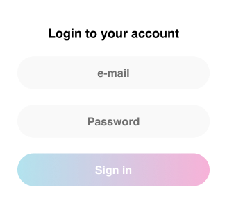
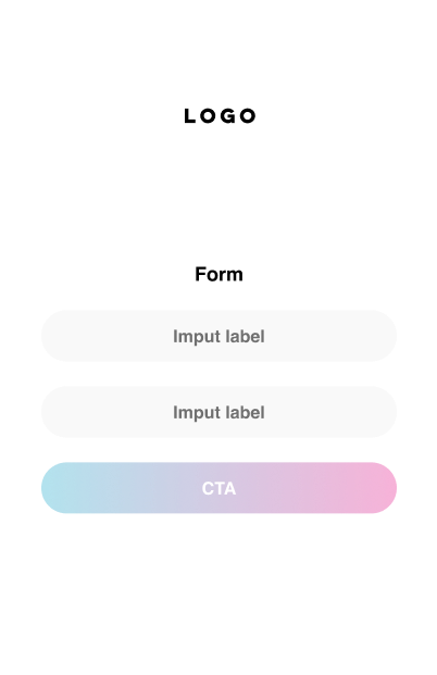
First, I don’t design anything
No components yet
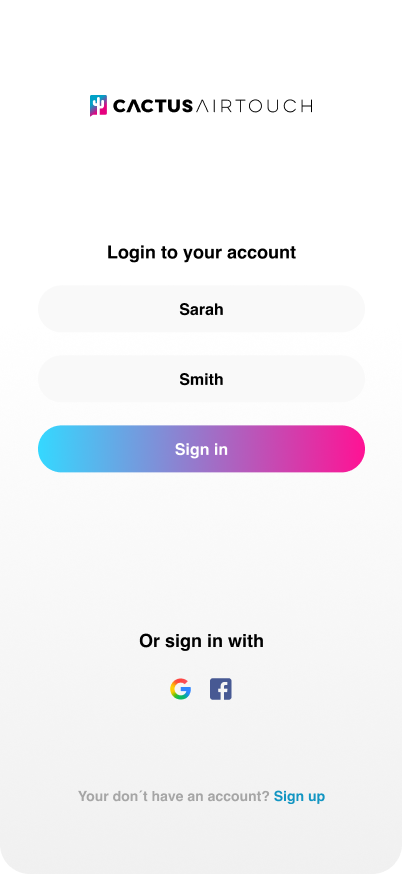
✅ I define a 50–900 scale
✅ I create semantic tokens (Success / Error / Warning / Info)
✅ I validate WCAG contrast
✅ I design for light and dark mode from the start
#1D4945
Color/500
#33706B
Color/400
#4A968F
Color/300
#73C0B9
Color/200
#A9E4DE
Color/100
#E7FAF8
Color/50
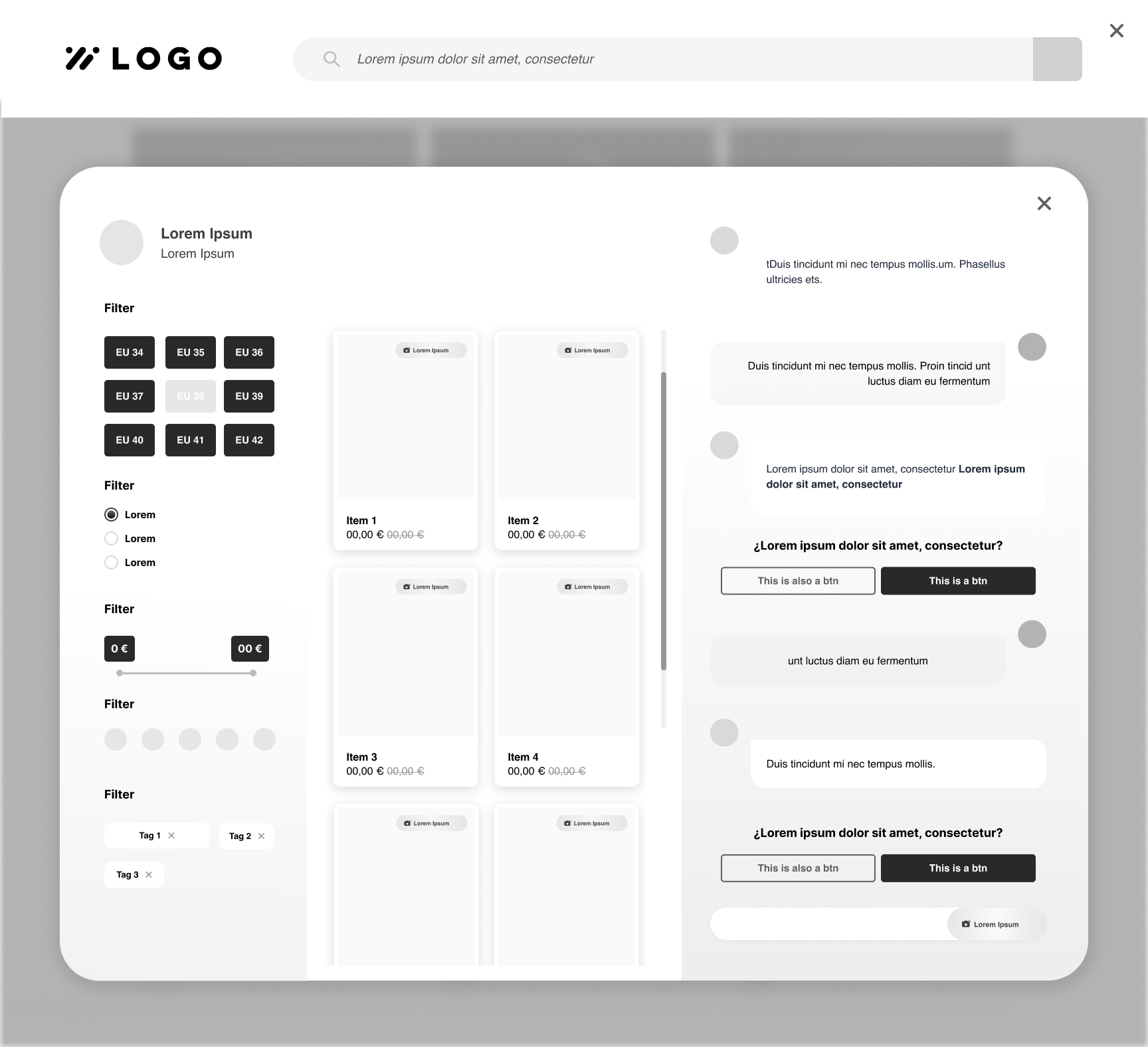
✅ 4pt or 8pt system
✅ Spacing tokens
✅ 12-column grid
Defined breakpoints
✅ Roles (Display / Heading / Body / Caption)
✅ Responsive behavior
✅ Line-height coherente
Structural rules: ➜
▪️ All components use Auto Layout
▪️ Spacing defined via tokens
▪️ No hard-coded values
▪️ Base component + variants logic
▪️ Semantic naming
css
color.primary.500
color.semantic.success.600
spacing.200
radius.medium
Component usage guidelines
Tokens (colors, typography, spacing)
Accessibility rules
Interaction patterns
Best practices
Correct and incorrect usage examples
Versioning and change management
A design system is not static
✅ Explain the system logic
✅ Teach how to use the library
✅ Show when to use each component
✅ Align criteria between designers
✅ Align naming with development
✅ Team feedback
✅ User testing
✅ Visual QA
✅ Review with development
✅ New use cases