Cactus Signage
Is a digital signage SaaS platform that allows brands and retailers to remotely manage multimedia content across screens and devices in real time. Designed to simplify content scheduling, player monitoring, and ROI tracking, it connects marketing teams with stores through a single, intuitive interface.
Project overview
Role: UX/UI Designer, Brand Designer.
Industry: Digital Signage / SaaS for Any Environment.
Location: Valencia, Spain.
Tools: Figma, Illustrator, Photoshop.
Design process
Discover
User & Market Research
Competitor Benchmark
Stakeholder Interviews
Define
User personas
Pain Points & Goals
User Flow Definition
Design & Deliver
Wireframes & Prototypes
Visual Design System
Usability Tests & Handoff
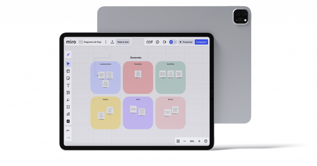
Affinity mapping
My design process is based on understanding the user and transforming insights into functional visual solutions. I use visual maps, post-its, and digital tools to structure ideas and define clear flows before moving on to interface design.
Problem & solution
Problem
❗Platform built from a generic template with no prior UX research.
❗ Features grew without structure, leading to a non-intuitive interface.
❗ Information overload that slows down even simple tasks.
❗ Very different user profiles, yet similar confusion and usability issues.
Solution
✅ Research-based redesign with clearer information architecture.
✅ Simplified workflows focused on key user needs.
✅ New visual language and unified design system.
✅ Continuous testing and training to validate improvements and reduce friction.
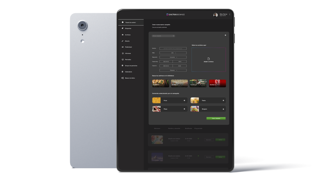
UI Kit
TThe interface follows the Cactus Design System, built with modular components, clear visual hierarchy, and high contrast to ensure proper on-screen legibility.
Text has been refined for greater clarity, and color plays a crucial role in helping users better understand priorities and system status.
Wireframing
Wireframes serve as the foundation of the interface, a bridge between ideas and visual design.
In this case, I worked directly in high-fidelity, since I already knew the platform very well. That helped stakeholders clearly understand the improvements and proposed changes without room for misinterpretation.
User testing
User testing was essential to validate design decisions and ensure that the CMS interface was intuitive for both technical and non-technical users.
The final prototype achieved smoother navigation, faster task completion, and greater user confidence in managing digital signage content.
Impact
The redesign not only delivered a more modern and brand-aligned aesthetic, it made the platform accessible for every type of user.
The experience is now clearer and more intuitive, which is especially noticeable during onboarding sessions: users learn faster and feel confident managing digital signage content from day one.
As a result, support tickets after training sessions have significantly decreased, confirming a positive impact on efficiency and overall product understanding.